Thursday, December 20, 2012

Shopping at the Artiste Gallery in Mansfield

Finish up your holiday shopping at the Artiste Gallery in Mansfield. It is an eclectic shop with merchandise crafted by local artists.


Recently, I was at the Artiste Gallery for an event.  What a great shop, featuring local artists and crafts people.  The items range form paintings to jewelry to homemade bath products and wood carvings.  The intimate shop is located on 263 North Main Street in downtown Mansfield.  What a great place to find something unique for the person who has everything.

Dotty Wyman is the principal designer at www.dottywymandesigns.com. Also, like me at www.facebook.com/dottywymandesigns.

Tuesday, October 23, 2012

Decorating with Paint - 2

The  Sherwin William's website takes a different approach to showing us the new color trends for 2013.  They provide an inspiration and then colors that project that feeling.  I have copied some of their insights to this page for you to see.  I like having two different approaches available.  Each time I start with a space I will use alternate ways to get started.  In this case I want to start with the color palette first.

The caption from Sherwin William's color trend page says, "Today's dynamic palettes reflect our diverse mindsets, lifestyles and design philosophies."  Below are the pictures and inspiration for their color trends.

Midnight Mystery

The colors are moody, the vibe is masculine and the aesthetic is both Victorian and futuristic.
SW - 2013 Forecast - Midnight Mystery Thumb

There are many deep rich colors in this color grouping.  The 3 I like most are;

SW 7593 - Rustic Red
SW 7593
 
SW 6131 - Chamois
SW 6131
 
 
SW 6004 - Mink
SW 6004


The colors are chalky and earthy, the materials raw and organic, the finishes matte.              
SW - 2013 Forecast - Honed Vitality Thumb
 
These colors are cool neutrals.  My top 3 are;
 
SW 7612 - Mountain Stream
SW 7612
 
SW 7739 - Herbal Wash
SW 7739
 
SW 7057 - Silver Strand
SW 7057
 
 
The pastels are a bit bolder, including semi-precious gem tones like citrine, peridot and amethyst, set off by crisp neutrals.         
SW - 2013 Forecast - Vintage Moxie Thumb
 
I agree these are bold pastels.  The 3 I think are most versatile are;
 
SW 0074 - Radiant Lilac
SW 0074
 
SW 0025 - Rosedust
SW 0025
 
SW 6401 - Independent Gold
SW 6401


Electronics, alternative rock and digital technology — plug those influences into one socket and you get a blast of high-voltage look-at-me colors.               
SW - 2013 Forecast - High Voltage Thumb
 
Pops of color can be very exciting in a room's decor.  My favorites;
 
SW 6859 - Feverish Pink
SW 6859
 
SW 6967 - Frank Blue
SW 6967
 
SW 6921 - Electric Lime
SW 6921
 
Some of these new colors are extremely bold and dark.  There are options available in the same color family that are softer and or lighter.  You can get more colors and details about Sherwin Williams trends for next year on their website www.sherwin-williams.com.

Dotty Wyman is the principal designer at www.dottywymandesigns.com. Also, like me at www.facebook.com/dottywymandesigns.


Tuesday, October 2, 2012

Decorating with Paint - 1

Do you want to freshen up a room with a new paint color?  Add new color accents to a neutral room with pillows, window treatments or upholstery fabric?  I am selecting some colors for a room I am designing and I needed some inspiration.  Currently, the room is a blank slate, so I have the opportunity to add color with paint, fabric and artwork.  The first place I checked out was the Benjamin Moore website to see their forecast of colors and was pleasantly surprised with all the color options and interesting color combinations they provided.

The trend colors for the 2012 section gave me ideas of new colors to mix together.  I noticed that gray, teal and burgundy/purple colors are very current.  Neutrals are always needed and Benjamin Moore helps you use them in different ways.


The two rooms above us the same color pallet, but in completely different approaches.  I like the dark trim in the first photo.  It is a unique twist from the traditional white or off white trim color.  The second picture has a sky blue ceiling with the dark walls.  This adds an extra dash of color and life to the dark green room.  The same colors were used in both rooms, but they have been used in varying locations.


The two views of this mirrored chest and artwork look completely different, even though the grouping of colors is the same.  The difference is the dominant color on the wall.  The first photo has a blue wall with red and dark taupe accent colors in the twigs.  The second photo uses the dark taupe on the wall and blue and red accents in the artwork and accessories.  I like that the same chest can have a traditional look and a more contemporary look just by changing a few accessories.

The Benjamin Moore website was fun to use for new ideas.  The 2012 trend colors can be viewed using the link provided.  http://www.benjaminmoore.com/en-us/for-your-home/color-trends-2012;jsessionid=HvJ1QpnBPNplk1xSzrKhQdKvz4W6H32J3bCNdDLDpJ3Qgvs8nJ3S!1556887689!NONE

I also viewed the Sherwin Williams website.  I will let you know what I found on this site next.

 Dotty Wyman is the principal designer at www.dottywymandesigns.com. Also, like me at www.facebook.com/dottywymandesigns.


Tuesday, April 17, 2012

Many seats for a small space


These days we tend to have informal gatherings of friends and family hanging out in the family room. Many times they are standing or sitting on the floor, because there isn't enough seating.  It is so nice to create places to sit in the family room to accommodate as many people as possible.  Even if it is just for friends to come over and watch television.  This family room is beautiful with it's beachy white walls, sofa and rug, but it also has seating for 8 people.  Everyone will be engaged in this close conversation area.  The smaller scaled chairs and ottomans allow for a lot of seating without crowding this small area.  Function and beauty will keep friends and family coming back to hang out in this home.


Dotty Wyman is the principal designer at www.dottywymandesigns.com. Also, like www.facebook.com/dottywymandesigns.

Monday, April 2, 2012

Contemporary Farmhouse Style Kitchen

This is a kitchen remodel I worked on last spring with a client.  She had lots of exciting ideas and was willing to expand the existing footprint of the kitchen.  The most challenging part of this project was fitting together cohesively all of the elements she wanted to include.  We successfully collaborated to create a new welcoming, more efficient kitchen the whole family likes to use.

The group of before pictures, shows a kitchen footprint that a family of four used every morning and evening together.  The table in the center was added for additional counter space, but took up valuable square footage and created a narrow passage through the kitchen in front of the refrigerator.


The client wanted a new larger kitchen with a contemporary farm house style.  First, the kitchen was bumped out 6 feet and a large new window was added over the sink.  The desired design was achieved by adding painted cabinetry, exposed beams, a large rustic black hammered metal hood and soapstone counter tops.  The cabinetry has inset doors which is a classic style for older built-in cabinets.  The rustic hood is the center of attention and is enhanced by the tiled wall behind it.  The open shelving on either side keeps your focus on the beautiful hood.  We opted to use recessed lighting, so the look of the beams would not be interrupted.  Finally, a long center table was added for more work space.  The base is made of reclaimed wood and the top is covered in stainless steel.  This kitchen now has the style the client envisioned and it is functional for her family.


Dotty Wyman is the principal designer at www.dottywymandesigns.com.    Also, like www.facebook.com/dottywymandesigns.

Tuesday, January 24, 2012

Decorating Dining Room - Accessorizing (8)

Finally, I have accessorized my new dining room.  I am happy to say, the last couple of months have been busy, so I haven't had much time to work on my own space. 


The accessorizing step of a design project is extremely important for providing the room a finished and pulled together feeling. Since the walls in my dining room are chocolate brown and the furniture is mahogany, I wanted to bring in some bright pops of color. I am able to do this with brightly colored glass bowls and vases.  Some of the artwork on the walls has white matting to add lightness too.  Without these accessories the room would look dull and uninteresting.


Accessorizing a room is time consuming.  Many times items that look great in the store, don't work as well in your home.  The goal is to have accessories that fit the room's new design and that you like them.  Also, in my project I wanted to reuse some of the items in the room, because these pieces had special meaning to me and my family.  Items that appeared dated were stored away.


My dining room isn't 100% complete.  I plan to add the mirror, pictured below, to the wall above the chest of draws and some type of throw on the dining table.  Please write me any comments or questions you may have about this redesign project.


Dotty Wyman is the principal designer at www.dottywymandesigns.com.

Tuesday, November 1, 2011

Accessories Shopping

Lately, I have done some accessories shopping for clients as well as myself (blogged dining room project).  It can be a challenge to find just the right items to complete a room's design and add some of your own personality.  Rules I try to follow are; if you have many accessories in a room they should look like you have collected them over time, and a more modern or contemporary room may only have a few accessories and each single item should add significant impact.

Shopping this trip has taken me to Wellesley, Newton and Natick.  One client was looking for kitchen and family room accessories.  We had luck finding a large cutting board and cheese dome to sit on her large island at Pottery Barn.  We also found, at Pottery Barn, some great glass candle holders with moss for her family room coffee table.  The pillar candles are wrapped in birch bark which add an organic element to the room.  This is a large space with a vaulted ceiling and required a substantial grouping of items.  Some other places we visited were Crate and Barrel and Bloomingdales.  No purchases at either, but they have some great items.  I was surprised that the prices at both are fairly reasonable.

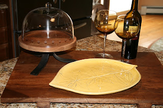
Decorative cutting board on kitchen island

Grouping of birch bark wrapped candles and moss in
 large hurricane holder 

 Artwork is another way to add layers and presonnality to a room.  Oil paintings and orignal art can be expensive, but add a tremendous amount of uniqueness and interest to a room.  Paintings help to fill in the open spaces of large walls.  They add height and color and keep your eyes moving around the room.  Below is a painting we selected from the Renjeau Gallery www.renjeau.com in Natick.

Oil painting above fireplace mantel

Once you have your most important accessories in place, you can find additional items at discount stores.  It takes a little extra time to poke around and uncover the choice items, but you can save some money.   Accessorizing can be hard work, but it is worth the effort.  A room will not look complete until those last few items are in place.  Good luck accessorizing the next room in your home.


Dotty Wyman is the principal designer at www.dottywymandesigns.com.